
Maddie’s


Project Details
Maddie’s Restaurant is a cozy, comfortable eatery in Denver, Colorado that couples a stellar breakfast menu with a charming, laid-back atmosphere.
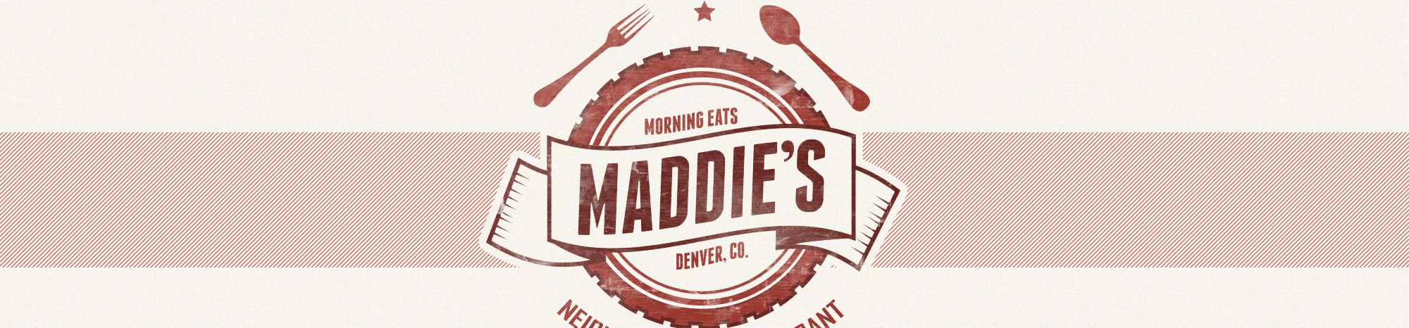
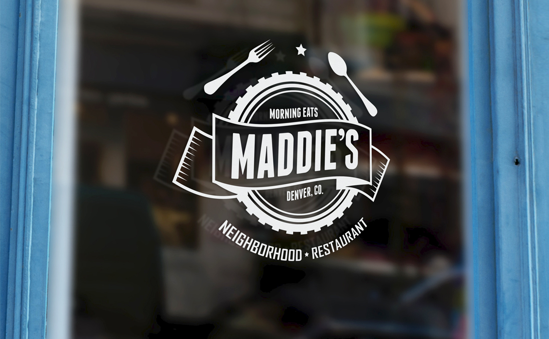
The restaurant’s fare is a throwback to hearty, simple dishes, made from scratch, and both the client and I wanted the restaurant’s brand to reflect the same kind of purity and simplicity.
Originally, the client suggested that I incorporate an illustration of his daughter — who the establishment is named after — in the logo, so I worked from a few photos to create a realistic likeness with vector art. After seeing the first round of concepts I submitted, we both agreed that the drawing was probably a little *too* accurate, and decided to head in more stylized, cartoon-like direction.
Throughout our discussions, the client expressed a preference for retro esthetics– particularly those of the 1950s –so in addition to the cartoon figures, I also began to experiment with badges and emblem motifs that harkened to that time period.
Ultimately, the client decided against having any kind of portrait included in the logo, so I began paring down the design a bit. Now that we weren’t incorporating a baby in the branding, the pastel color palette felt a little too young and feminine, so I introduced a few new colors that felt a little more mature, and less gender-specific. I also doubled-down on the retro signage, and added the fork and spoon elements to visually reinforce that Maddie’s was a great place to enjoy a meal.
Project Roles
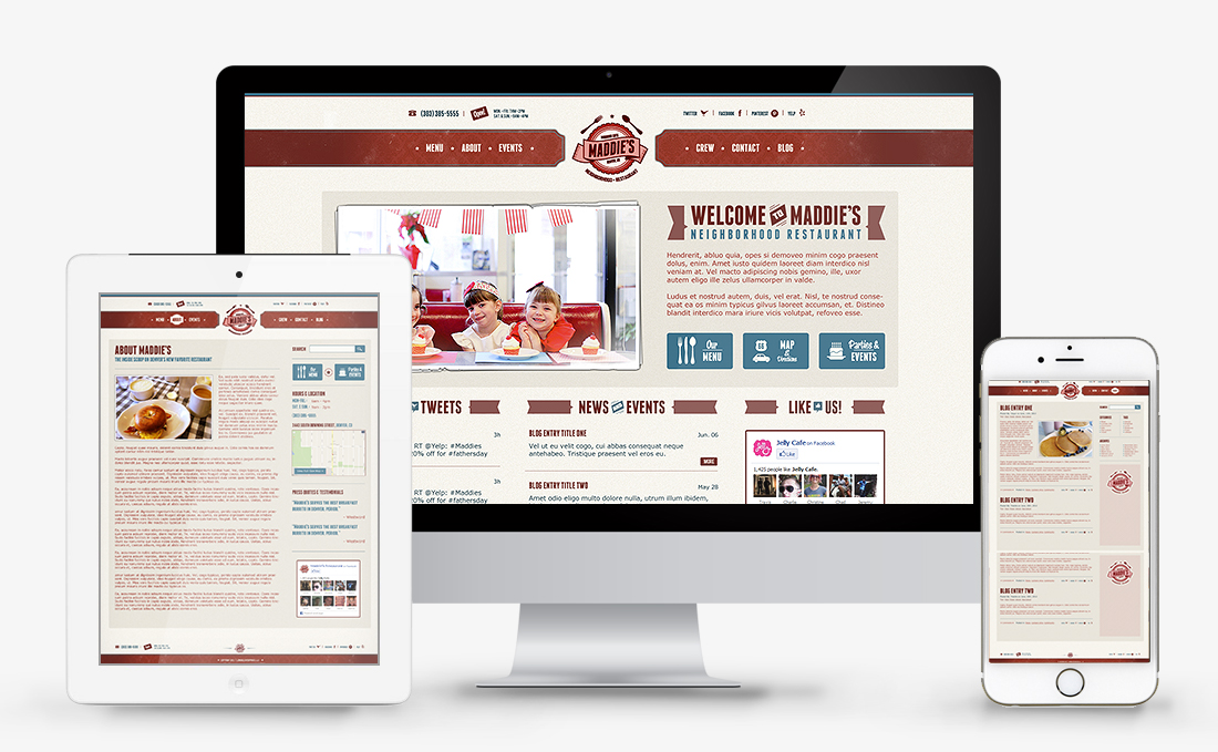
Art Direction | Branding | Web Design | Graphics | Illustration