
Continuity Image + Motion

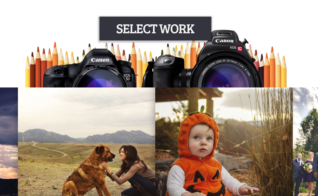
Project Details
Continuity Image + Motion is Site07’s sister company; a photo and video boutique, specializing in editorial portrait photography and high-end wedding cinema.
I run Continuity as an entirely separate business entity, but given that it shares an immediate link through me, I wanted to make sure that I developed branding, and web design that reflected the mutual connection, while being divergent enough to give both companies their own unique visual character.
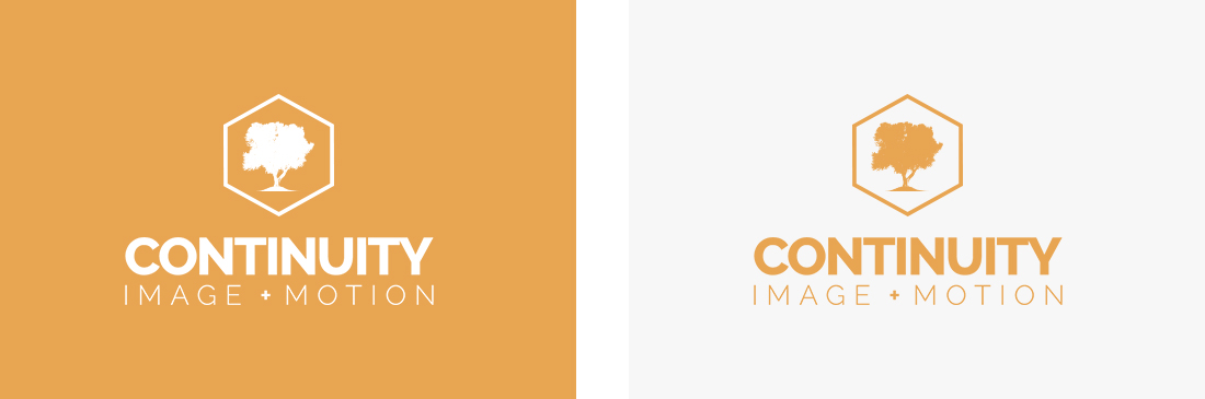
With that in mind, I chose to use quite a bit of orange in the color palette– orange is directly complimentary to Site07’s teal on a color wheel, and I felt it would fit in nicely with the generally bright, cheerful atmosphere most wedding and portrait clients are looking for.
Similarly, I carried over the hexagonal theme from Site07’s mark, but substituted the stylized “s” with the silhouette of a tall oak.
I felt strongly that I wanted to avoid using an illustration of a camera or perforated film anywhere in the logo, as those two images are hopelessly overused and abused in the industry, and I thought the symbology of a lush, verdant tree nicely reinforced the company’s name, and the meaning behind it; timelessness.
Since photographs and video are simultaneously dynamic and archival mediums, I wanted to thread the idea of life, growth, and perpetuity throughout the trade name, and the iconography.
In terms of the web design, I knew I needed to accomplish a few things in order to effectively engage the families, individuals, and brides-to-be that would be making up my prospective clientele.
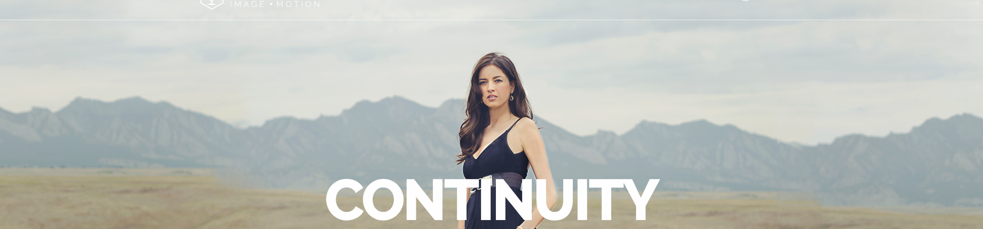
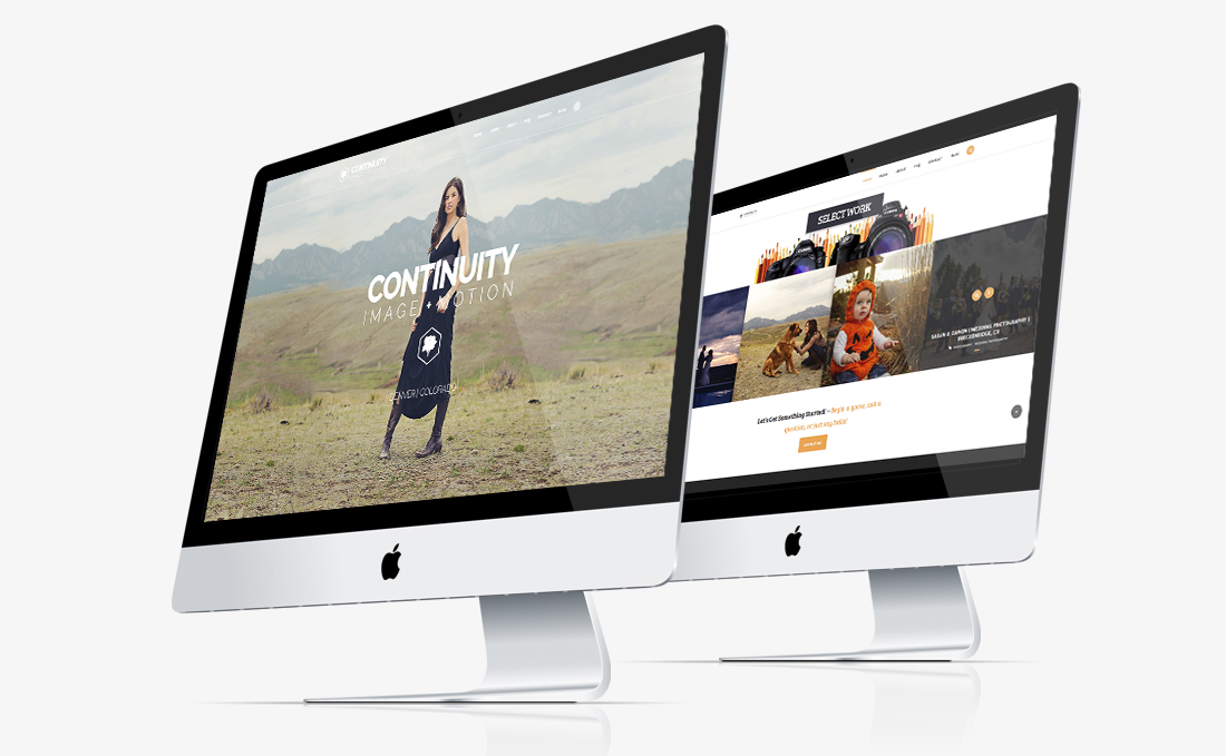
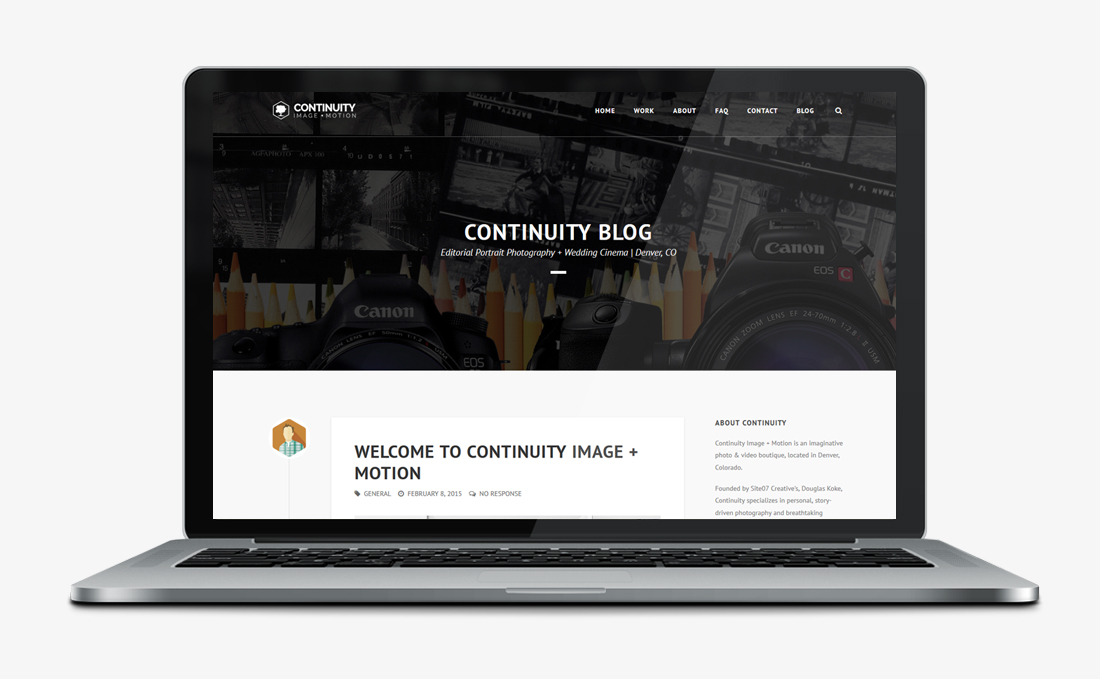
First and foremost, I knew the site had to be upbeat, easy to use, and put the content front and center. I also knew that I needed to balance elegance with a sense of playfulness, and skew the design towards the feminine, as women generally tend to be the decision-makers when dealing with portraits, fashion, and weddings.
To that effect, I made sure to employ bright, solid colors, and a clean, graceful layout, so that I would have plenty of room to display large, crisp images, and expansive video. I also employed friendly, welcoming fonts that felt contemporary, and just a little girly.
Lastly, I worked hard to make sure I struck the right tone with the site’s copy, and all of the supporting materials I would be distributing– estimates and proposals, invoices, letterhead, etc. I wanted to make sure that every element the client came in contact with was just as good as the films and images being featured, that I was constantly reinforcing a feeling of competence and professionalism.
Project Roles
Art Direction | Branding | Logo Design | Graphics | Web Design | Print Design | Copywriting